Sidebars: the Best UI Components and How to Build one!
Due to the fact that on our mobile phones there is not a lot of space where we can show the content, a good sidebar can do the trick and help a lot.
There are many things you can display in a sidebar:
- A contact form
- Social Channels
- Navigation
We’ll Go through each and explain. However, before we get there, it is of utmost importance to explain why are sidebars the best idea for your mobile website.
First, they are non-intrusive. This means that usually, sidebars no dot stay on your screen, hence giving you more space to display your content.
Secondly, they can help you attract users and customers. Sidebars can and do help the overall page design, despite the fact that they are hidden. Here is how:
- they offer contrast: if your website page has a white background, you can style your sidebar to be black, or have a darker background picture attached. If you like modern design, you might also consider having the same background colour. It’s all up to your taste,
- They improve the User Experience not just the User Interface: animations are your best friend if used correctly. Therefore, a fluid animated sidebar can leave a great impression on your users.
And last but not least, sidebars help you better organise your website. They are the best option if you have lots of pages and you cannot display them in a sticky, bottom, 5 displayable elements menu. Here you have some great examples!
1. A Contact Form
This usually is the sidebar that opens form the right. However, this is not a norm. But because most of people, excepting the countries that have RTL reading, read from left to right, it is just intuitive to have the main sidebar (which you access a lot) on the left and the contact (which is not so often used) on the right.
Keep in mind that there are website templates, like ours, that allow you to choose the position of each sidebar. Therefore, don’t worry, there is a solution for everything.
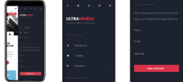
Down, you have an example of contact form sidebar in UltraMobile:
2. Social Channels
If you have a contact form and you also want to connect users with other social platforms you have, you can do them both in the same sidebar. However, there are people that do not have a contact form. Therefore, linking your socials on a sidebar can be the best choice for you, together with a phone number and your business address!
Here you have some examples:
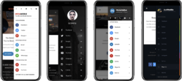
The Products displayed are, in the same order: MegaMobile, Sceena 3D, Materialise and JustMobile.
3. Navigation
There are two types of navigation sidebars, therefore we’ll cut this into two smaller pieces as follows
a. Simple Sidebar
When we talk about a simple sidebar we refer to the way the pages are displayed. Therefore, in such case, you will have only the main pages there, with no submenus. You can reach the submenus only after you click on one main page. After you click, a page will appear containing the submenus.
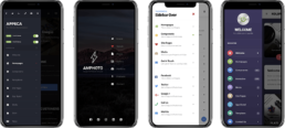
Check out the examples below. (Appeca, AMP Photo, Apptastic, Kolor)
b. Multiple Components
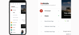
A multiple components sidebar contains a list that falls down under the main page without leaving the sidebar. The submenus are integrated there.
Check out the example below on BeMobile.
Keep in mind that there are many ways you can style your sidebar. The colours you choose or the design is all up to you. However, make sure you take into consideration this: Don’t overcrowd it with tons of text. If it tells the story, make it short and let it breathe!
PS. We also have a special Halloween Gift For You. Everything you need to do is hit the button below and subscribe to our newsletter. Get your Halloween Freebie on 31st of October!

